Continue reading
Your site, social media page, or brand are like a dark room - you have no idea what’s going on inside, how customers interact with your product, what they think about your content and so on. That is, until you turn on the flashlight of analytics. Suddenly, you can see that customers hated your posts about super bowl and your inspirational proverbs but totally loved your silly videos about cats; that they had troubles subscribing to your newsletter on a site and have no idea how to navigate the pricing page.
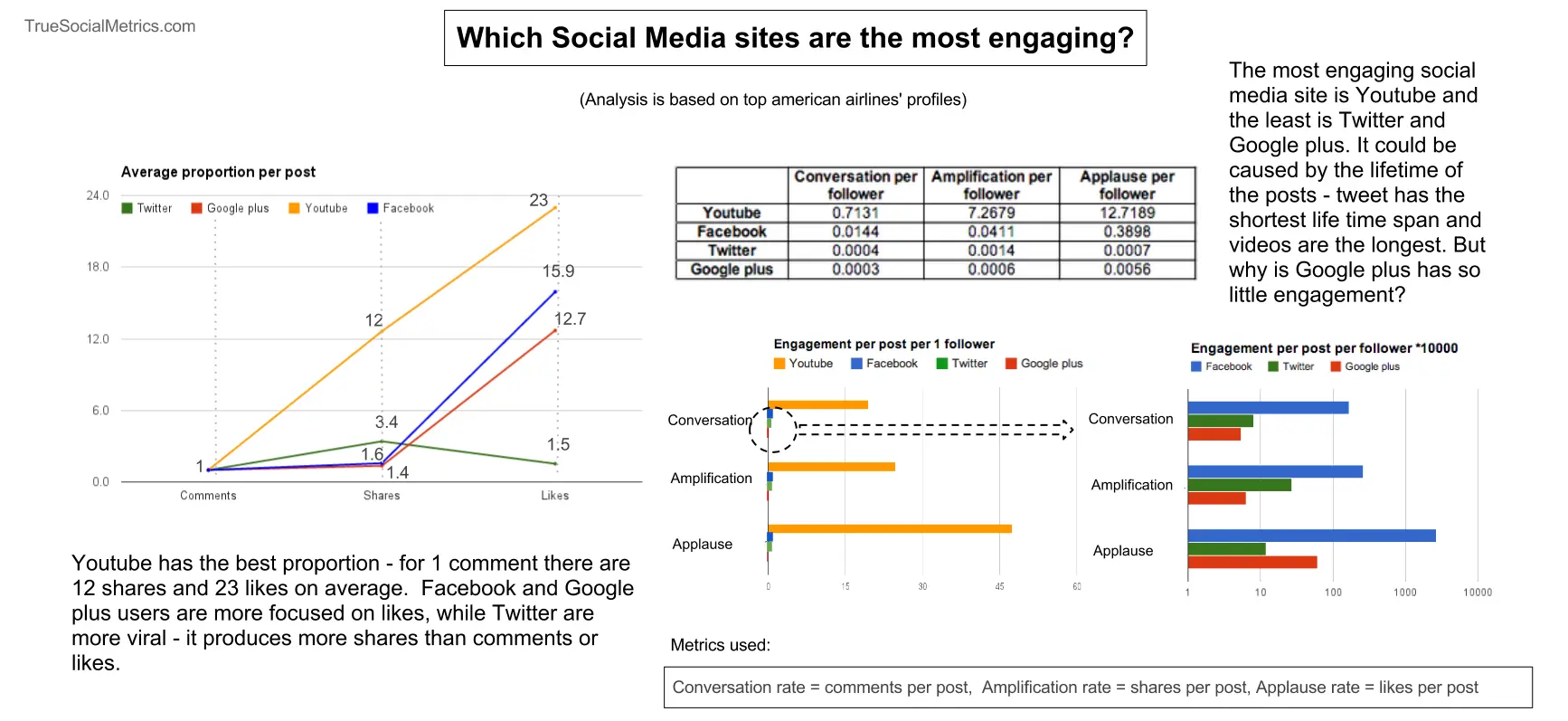
Burberry has 17 mln followers but only around 0.06% of them react to their posts. Why do they stink so much? And how to make sure that your brand isn’t falling into the same trap?
The classic A/B testing is a distribution between a different states. Let’s start from a general sample everyone uses. We have a site with a signup button, currently it’s blue, but we want to test a new color red.
For a long time, we have been living in a world where we use default approaches without fully thinking about their purpose. Take WordPress as an example: it's a powerful application, but it requires MySQL as its database, and to make it fast, you often need Memcache to cache MySQL queries and reduce database load. Alongside, there's the WYSIWYG editor, which, in theory, allows users to edit HTML easily, but in practice often generates unreadable, bloated code.