Measuring and Improving Adwords Campaign Quality and Cost
by Member of TrueSocialMetrics team ~ 4 min
Our first attempt to use Adwords was a bit disappointing :)The traffic from Adwords had poor quality and was very expensive. So here’s our story how we dealt with this. The main reasons for our fiasco were problems with Quality score of the keywords. The symptoms looked like that: the keywords were “degrading” with the flow of time (during a month in average): the CPC were increasing and quality score - lowering. And we almost have no text on pages, making it hard to convince Google that keywords we use to advertise are relevant to our site. I must add that we had a low budget and a very few visits, so it took us some time to see the results of improvements. Usually, it would be happening faster.
April
I used this report to decide which keywords, adgroups and campaigns were totally ineffective. 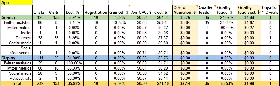
In this report:
- “Lost” - users who disappeared between click and visit to the site.
- Gained - percentage is simply the acquisition rate.
- Quality leads - are users who performed at least one action on the site - in our case connected at least one social media account.
These metrics were calculated with the help of Advanced segment in Google Analytics. Display network campaign was disastrous considering it’s quality, but was very cheap, so I decided to give it another chance. Then optimized adgroups leaving only 1 keyword per group and only best performing ads (best CTR and conversion rate). The next step was duplicating best performing ads and using different destination URLs to test which ones are more effective. At last, got rid of the countries which brought us lower-quality leads (high Bounce rate plus users don’t use core features).
May
Finally my efforts brought results and Quality score of keywords increased for 1 point and became 5/10 (sometimes even blinked for 6/10). It was a huge breakthrough because significantly reduced average CPC.
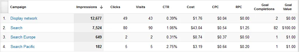
I followed the advice of experts and created different campaigns for different geographical regions – US, Europe, Pacific. Logically this should have increased CTR and separate best-performing countries from ill-performing. Also I researched new keyword ideas and created new adgroups.
June
That geographical separation didn’t work. It ruined all I have achieved in previous month. It is a mystery to me, but quality scores decreased and CPC increased for all campaigns.So I got rid of geographical separation and all was back to square one – 1 campaign for all countries.
I Used totally awesome new PPC reports from Avinash (they are available for download). Here how they looked in my case with small customization (Revenue is replaced with Goal Value and Transactions with Goal Completions):
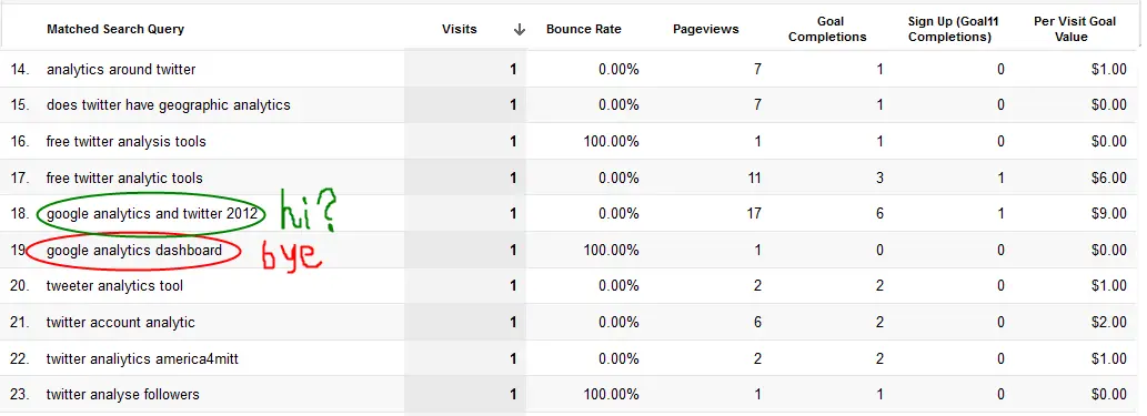
Comparing CPC vs RPC metrics is the coolest thing ever. Of course, RPC isn’t very accurate in case of non-profit, but still it mega rocks! Keyword/Matched query report useful for defining negative keywords and new ideas for ad groups:
I also used very helpful report “Keywords Match type Revenue” to find out that I should switch broad match to phrase match for some keywords.
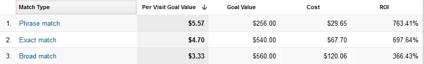
Comparing Cost to Revenue (or Total Goal Value in case of non-profits) will show you which match type brings you the most benefit per each keyword. This report I also learned from Avinash Kaushik’s article (except that I used Google Analytics to create it, due to zero budget allocated for analytics purposes :) ) You can download this report for GA here. I finally paused Display Network Campaign - it brought us absolutely rubbish traffic (not a single quality lead). And lots of efforts to change this state went all in vain.
July
The performance significantly increased: cost decreased and the quality of the traffic increased (less abandoners, more pages per visit, more time on site, higher conversion rate, more goals completed). More good users for lower cost. Everybody’s happy :)
Here’s how it looked liked in numbers: 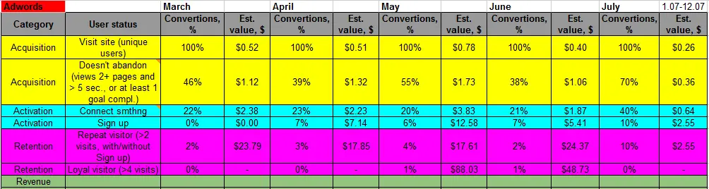
This model of KPIs was inspired by AARRR-model for startups. Unfortunately, we have no profit, so the last and the most tasty green row remains blank for now.
Now we are facing the new challenge: how to increase number of impressions. We lost more than 70 % of Impression Share due to low AdRank, quality score remains only 5/10. But that’s a topic for another story :)
When you’re ready to rock your social media analytics
give TrueSocialMetrics a try!
Start Trial
No credit card required.
Continue reading
Google Analytics Multi-device Tracking and Measurement Protocol

Google+ Communities: Analyzing Community Health

10 Tiny TrueSocialMetrics Tweaks to Save More Time On Your Social Media Analytics

Google Analytics Hacks
